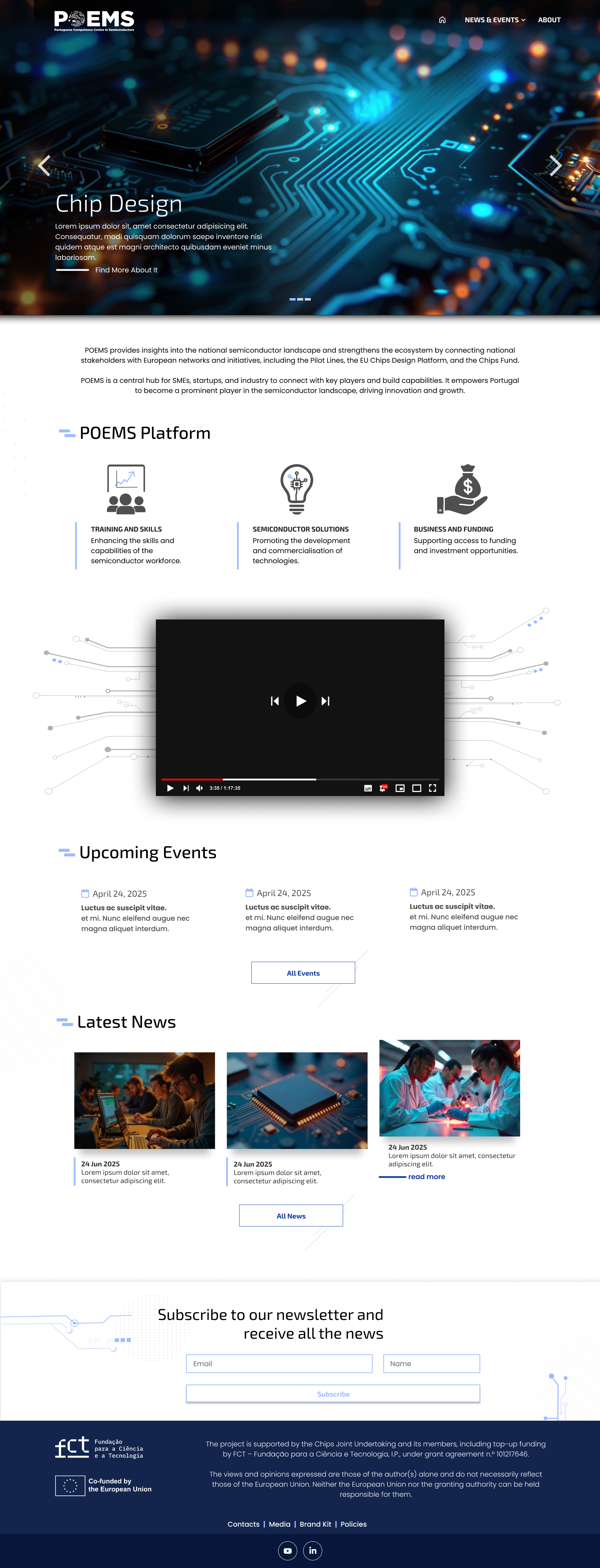
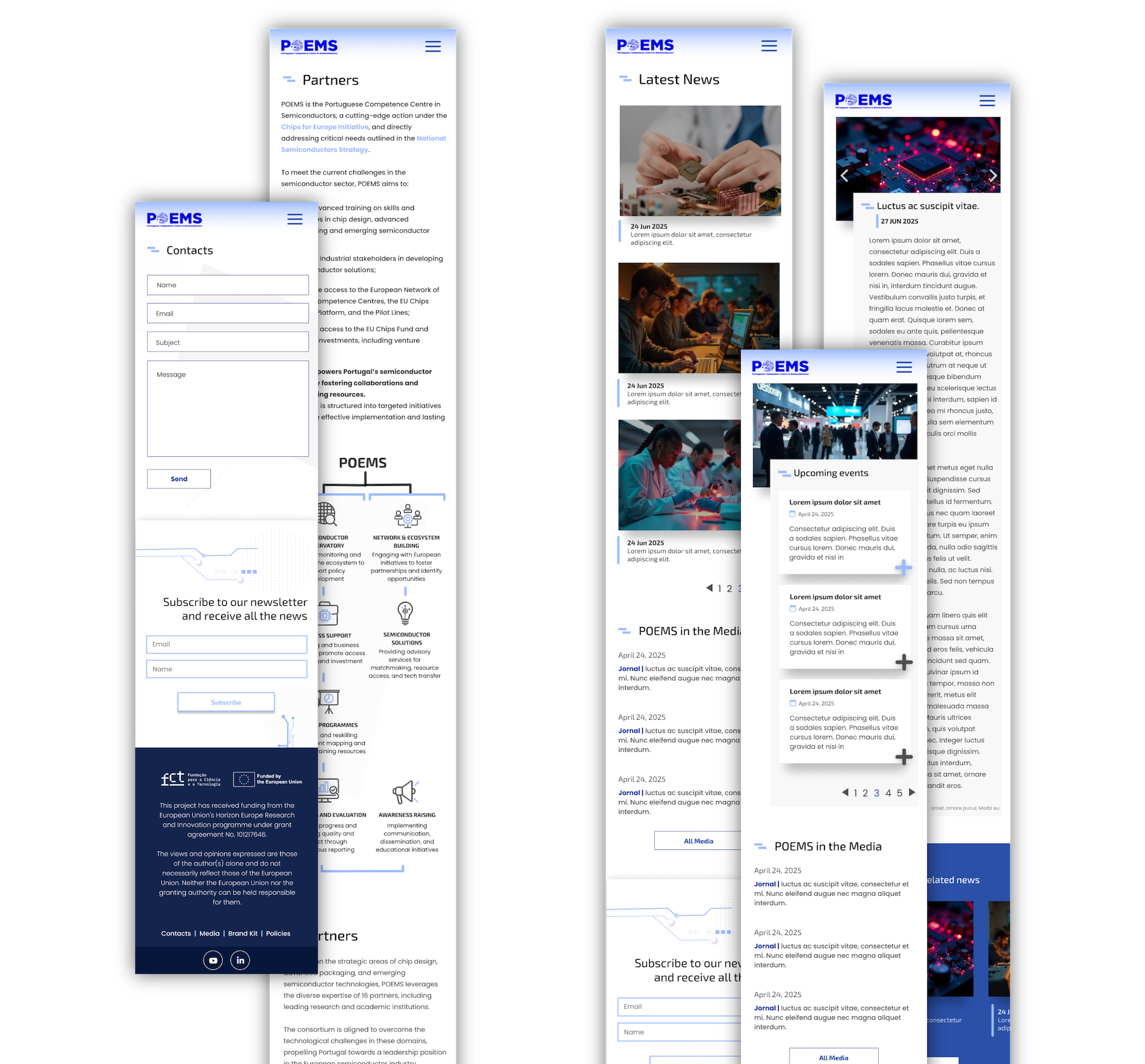
POEMS
(Portuguese Competence Centre in Semiconductors)
A website I developed and designed for a European project
about semiconductors, creating a
responsive and visually
engaging experience.
MY ROLE
Web Development
MY RESPONSIBILITIES
UX/UI Design, Front-End Development, HTML, CSS, JavaScript, Responsive Web Design, Cross-Browser Compatibility, Debugging, Graphic Design, Visual Optimization.
THE URL
https://www.poemscentre.eu/en/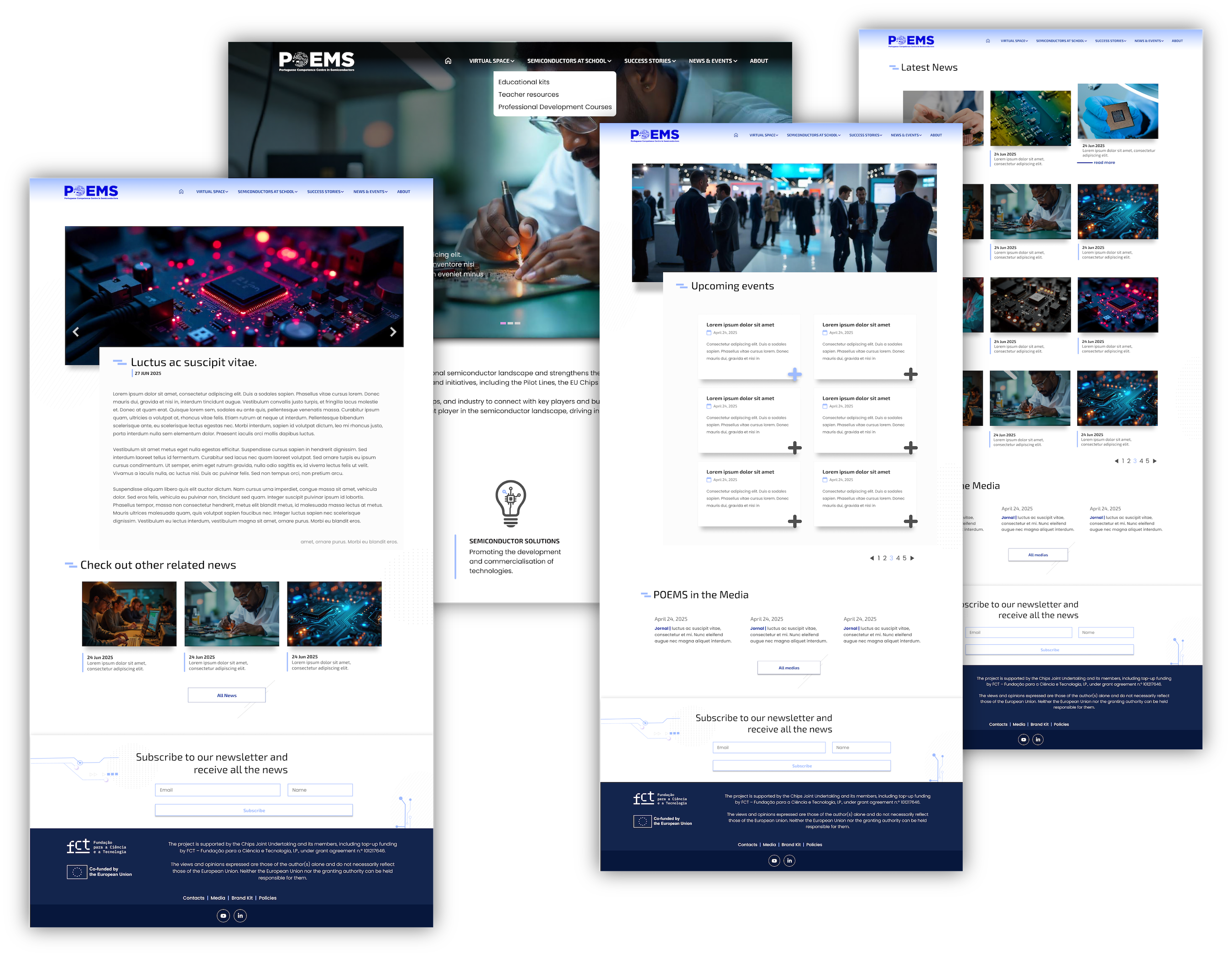
The Challenge
This project was a challenge from the start due to several factors.
First, it was my
first European project, and I was surprised to find that there's a whole consortium that
makes and influences all the decisions. In this case, we're talking about a consortium of 17
different entities, which means 17 companies (each with one or more representatives) trying
to reach a consensus on what they want for the website. This was, without a doubt, the
biggest challenge.
Second, the color chosen to represent POEMS was #0000DD, which is,
for the record, a difficult color to work with for the web. I tried to work around this by
using a soft, yet still prominent, highlight color (#9EBBFF), as well as a set of other blue
shades to balance the visual impact of the chosen blue's "strength."
A side
note: Contrary to the perception of a color's "visual strength," contrast for
the web is measured by the difference in brightness between two adjacent colors. For
readability and accessibility (WCAG compliance), a significant separation in this brightness
is crucial.
this is the Logo Color:
#0000DD
This was the palette I chose:
#ffffff
#1E1E1E
#4f4f4f
#13254D
#123C9E
#9EBBFF

The "Plot twist"
Just so you know, I created 7 different versions of this site —> seven versions.
In the end, with less than 48 hours left before the site was due, a pink color palette was decided upon (not by me). This had to be used instead of the shades I had previously selected, forcing me to make a complete readjustment.
While I
still prefer the blue tones, the pinks didn't turn out to be a disaster.
Logo Color:
#0000DD
Pink palette:
#ffffff
#1E1E1E
#4f4f4f
#DE99E0
#CC71C8
#B2248F
Nowadays
Today, I'm still involved in maintaining the structure of the main pages and the layouts I predefined
for some secondary pages. However, I have zero influence over the images (and I have to confess that
this often gets to me 🥲), but it is what it is 😅.
It was still an incredible experience to
be involved in a project of this scale. Since the topic is technology, I thought a modern yet
institutional website would be appropriate, and within the limitations that were imposed, I think I
managed to create that mix.
This project will still undergo many changes. For now, it's a
"basic" site with pages just to publicize that this initiative is happening, but it will become
something much bigger. I can't reveal much more for now, but keep an eye on it to see what's
happening 😉.